Case study 3:
Creating a 3D population visualization.
Sometimes we have too much data to easily display it without making confusion. A presentation is sometimes better when we use 3D templates of the display and charts.
We will create a 3D presentation that can be downloaded and opened in other environments that do not have GIS tools. A browser (such as Firefox) is sufficient to open the product. The model will be built using the Qgis2threejs plug-in.
We downloaded:
- Number of population by large age groups - from 0 to 14 years, total, 2017 (STAGE II)
- Number of population by large age groups - from 15 to 64 years, total, 2017 (STAGE II)
- Number of population by major age groups - 65 or more years, total, 2017 (STAGE II)
First, we will perform a join of attribute tables all three age groups, to have one vector layer with all the data. The tool Join attributes table can be found in the Processing Toolbox.
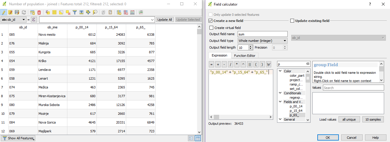
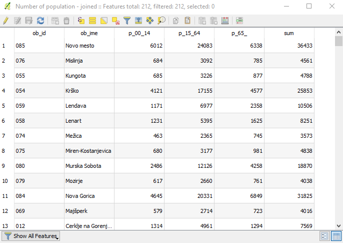
When we join our data, we have the following data structure. We also created a new column, which contains data on the sum of all population numbers.
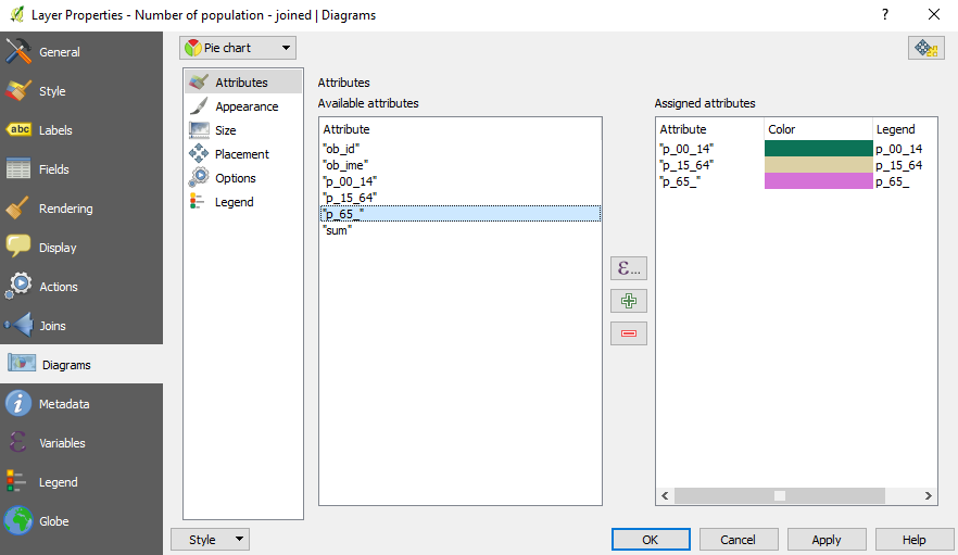
We will display the population distribution with a pie chart diagram. The diagram option is reachable by double clicking on the name of the layer.
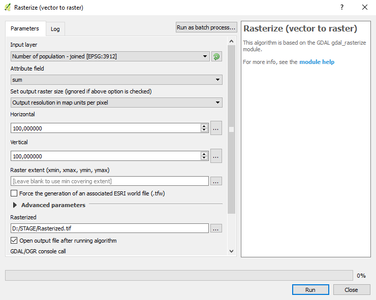
After the diagrams were created, we generated a raster layer from the data of the line sum, which contains the values of the population. We set the vector layer a 100 % transparency to display the pie charts over the raster basemap.
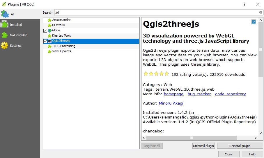
The plugin was installed using the Plugins tool and used to create a 3D display, where raster cell values were displayed as heights.
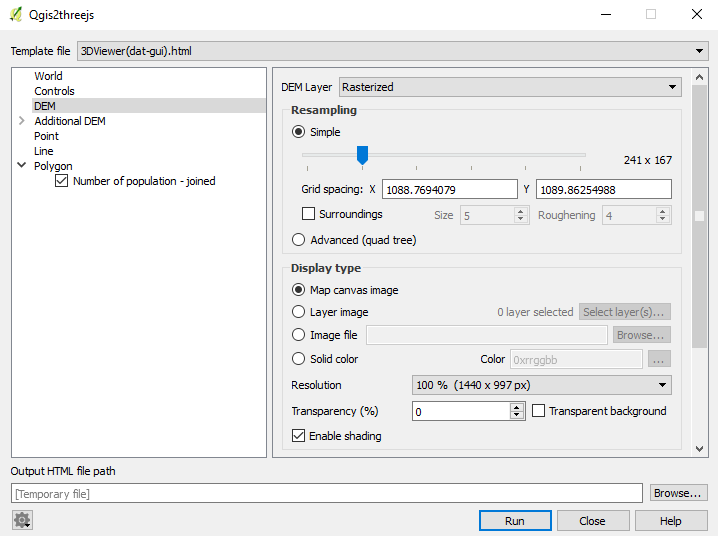
The result opens in the default web browser. The result is a 3D view of our area showing population differences and diagrams that distinguish population into age groups. The result can be rotated, zoomed and panned as desired.